01.
OBJECTIVE Each year, Kent State's School of Visual Communication Design has the students of their BA program put on a show to showcase their work from the past four years. In order to split up the vast amount of work that it took to put this show on, we worked in teams. My team was assigned with the task of overseeing the general art direction. After the entire class voted on a visual direction, my group was tasked with providing an identity for the show and a set of guidelines for each group to follow in the execution of their individual tasks.
02.
APPROACH Below you will see some of my contributions to our team's ideation for the art direction of the show. Please keep in mind that I was working with a predetermined selection of typefaces and colors. The colors selected by the class were vibrant and eye-catching. Eventually, we concluded that we would keep the vibrancy of these colors in mind and utilize them in our concept. The bright hues effectively played on the portion of our concept that reflected moving on to new and exciting parts of our lives.
03.
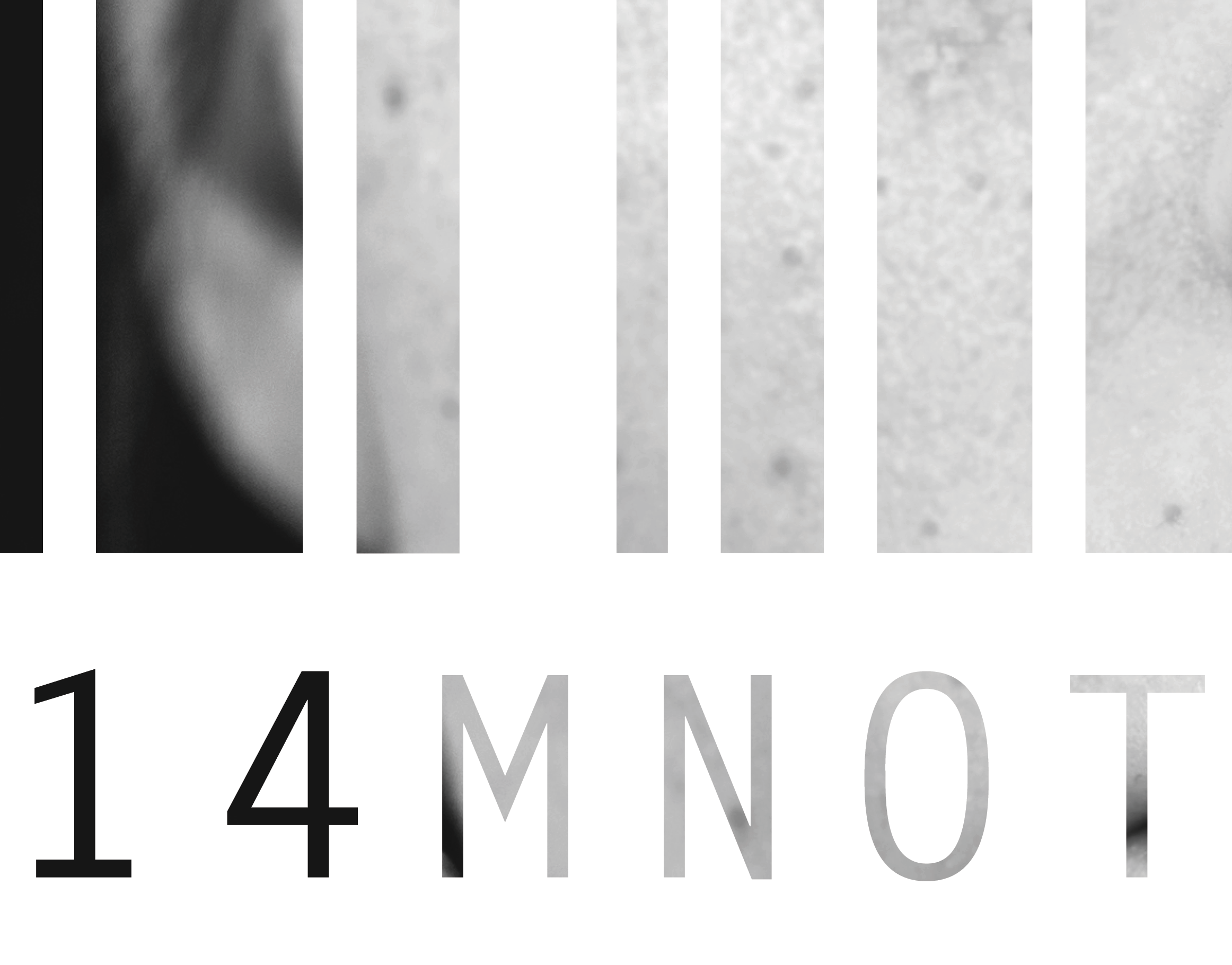
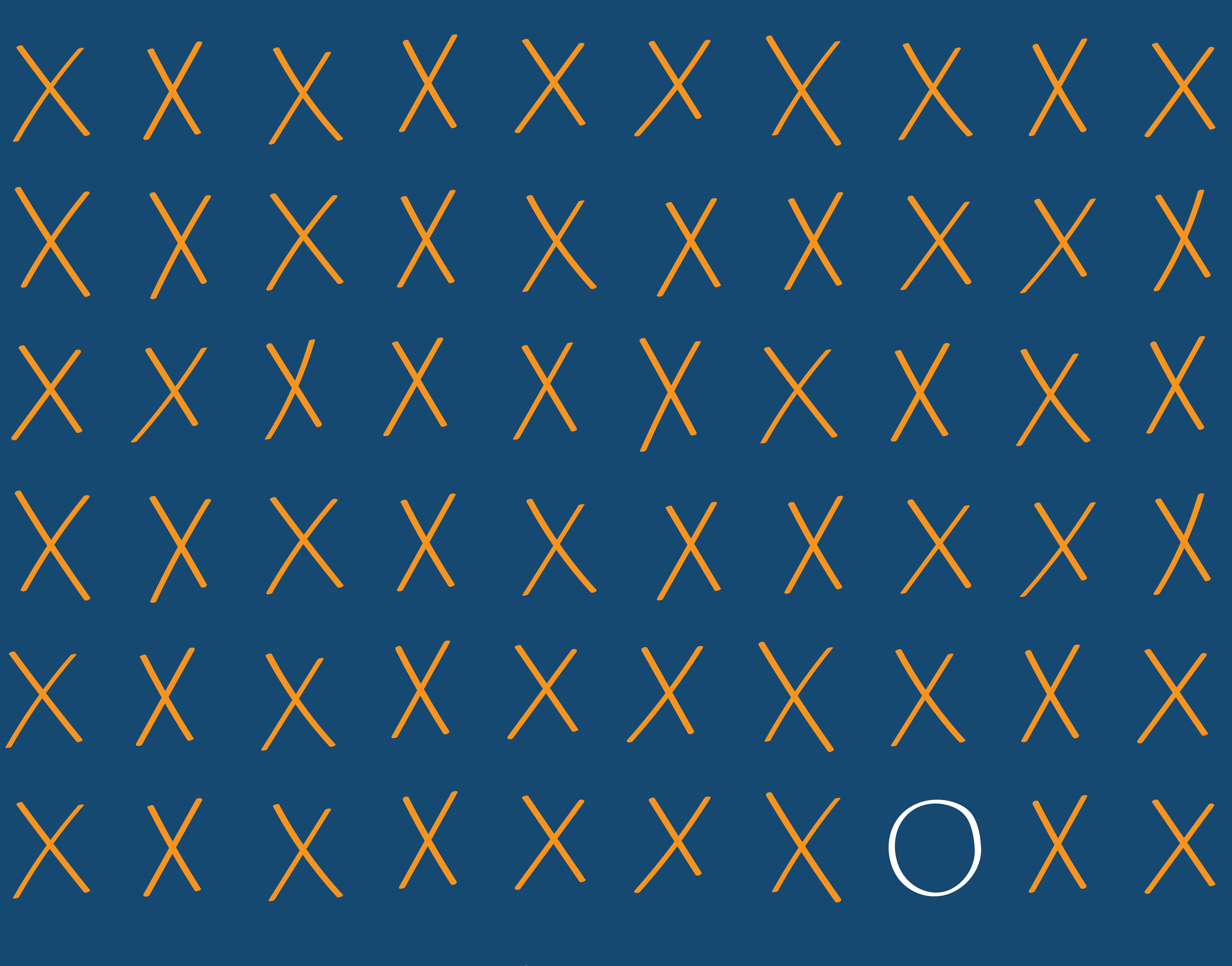
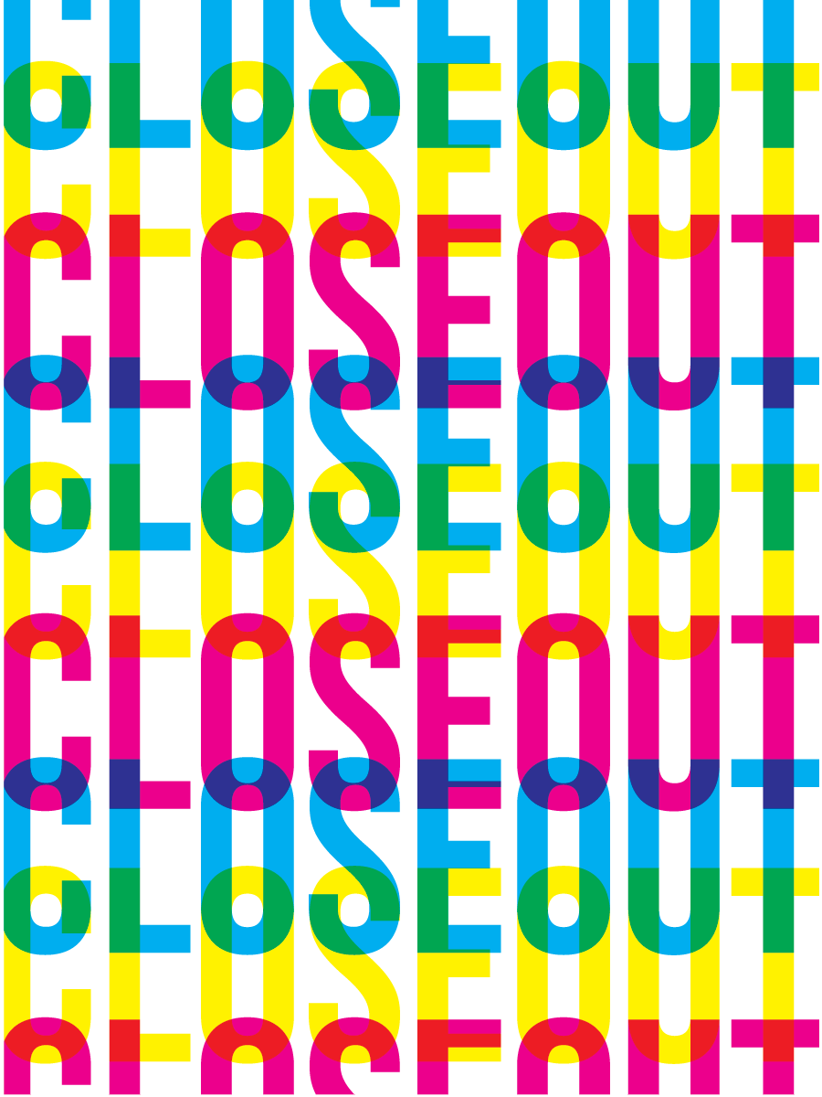
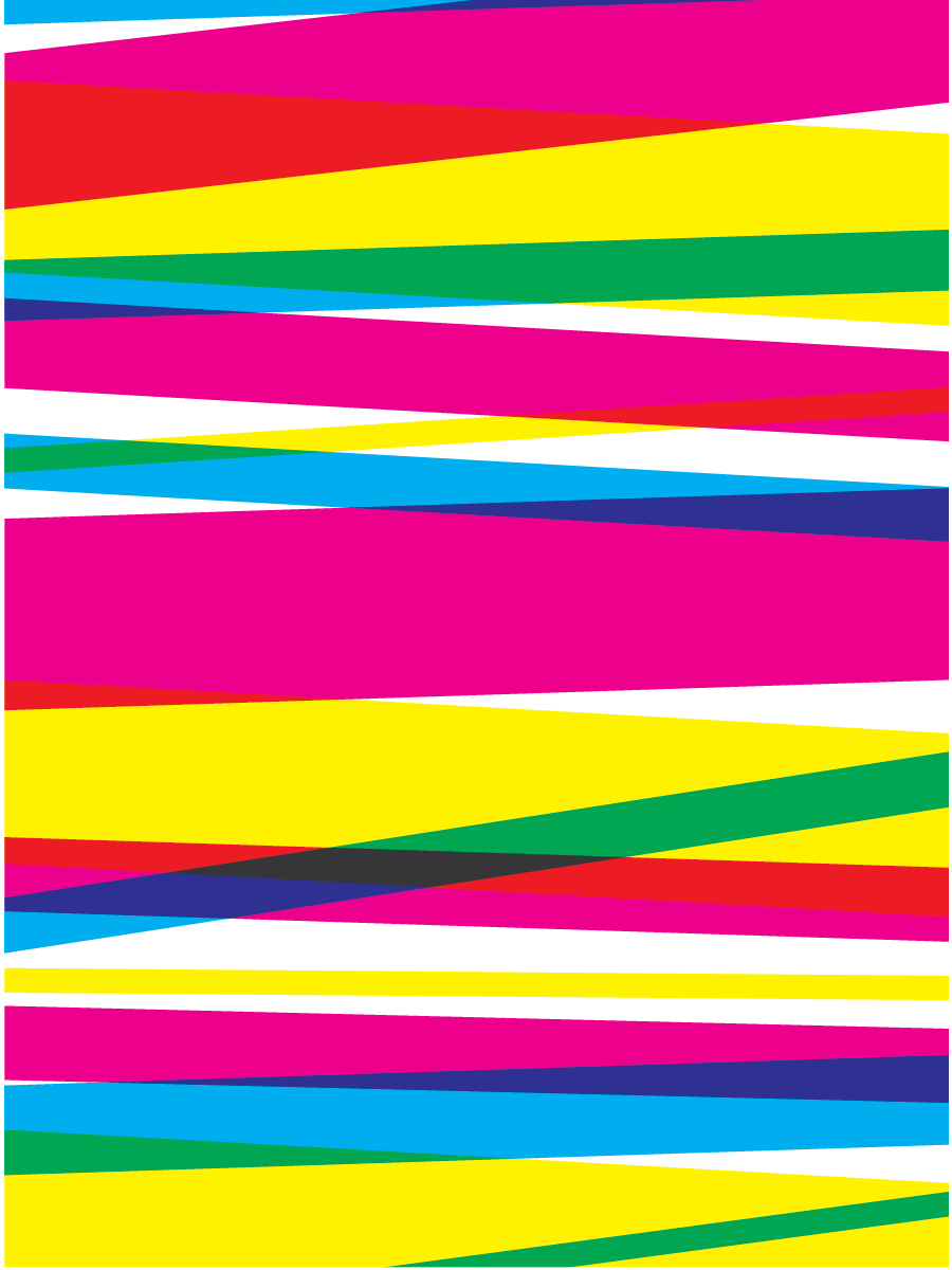
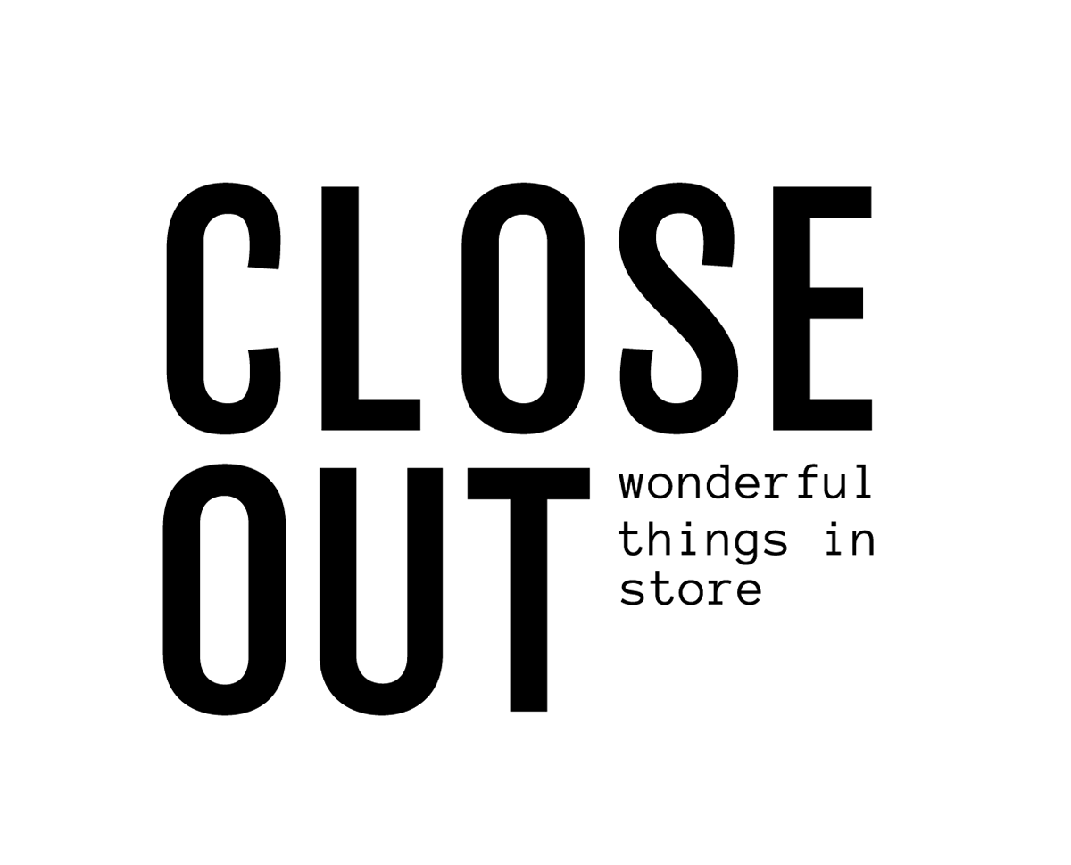
PATTERNS AND IDENTITY One element we were sure we wanted to include in the show were some unique patterns. There were four large walls on the back of the gallery that we didn't want to let go to waste. We figured these patterns would either be best used there and on promotional material as well. I wanted to experiment with layering the fun colors of our color palette and transparency. The patterns shown above are some of the end results. I continued to experiment with shapes and letterforms and presented my ideas to our group for consideration. As I touched on before, I used predetermined typefaces to create options for identity lockups for the show. Our name and tagline had also already been decided, so all that was left to do was create a few options for lockups. The team wanted to stick with a simple, type-driven look so that we could have fun with the colors and shapes elsewhere. The lockups shown above are some of the options that I presented to the group. I kept alignments in mind and tried to make the most of the unique typefaces selected.
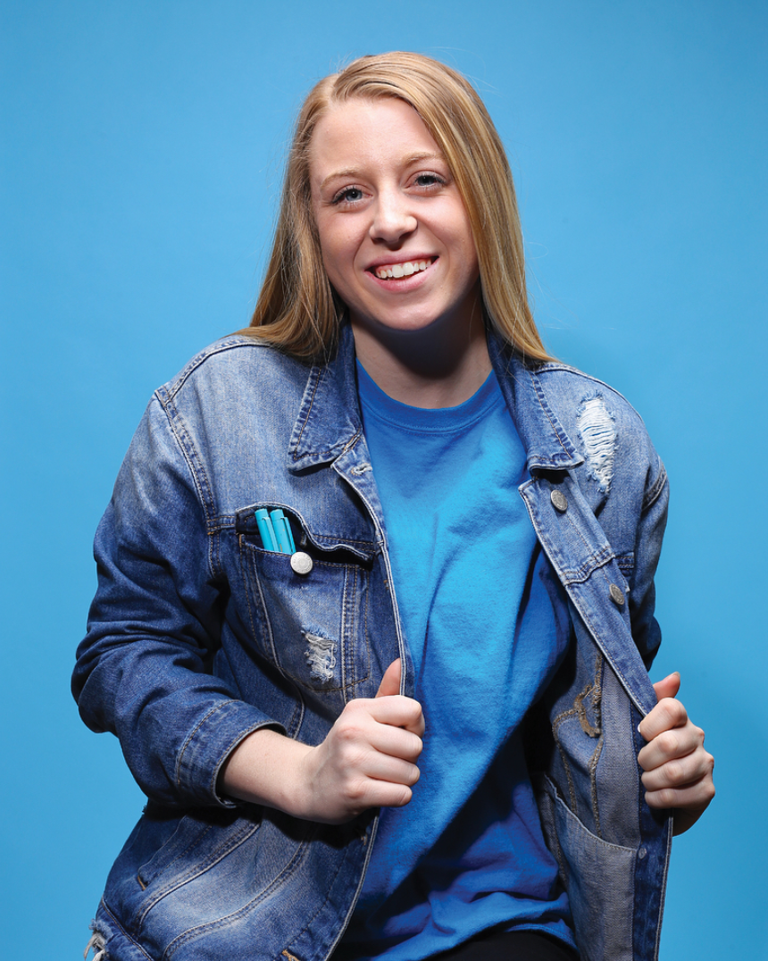
04.
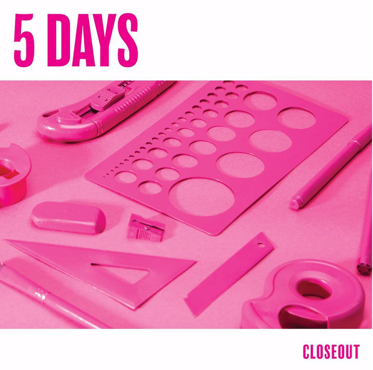
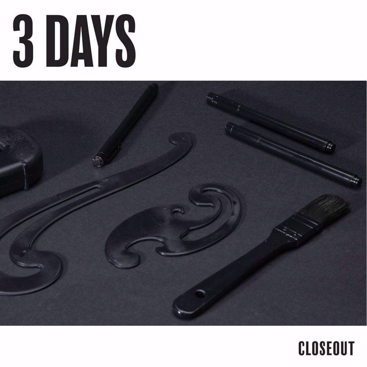
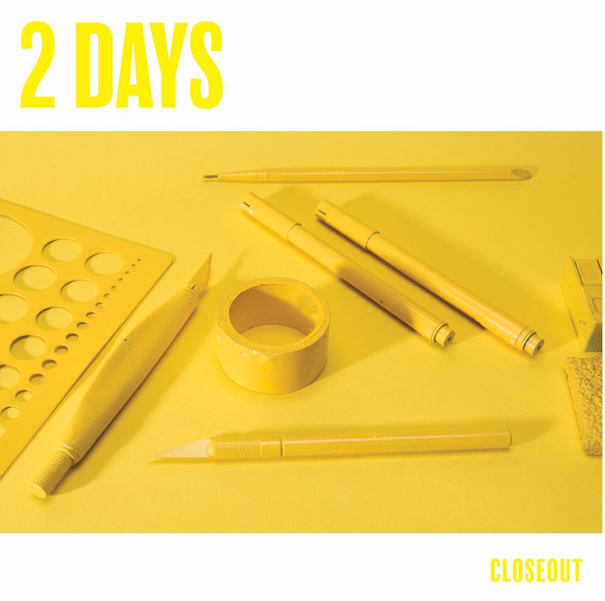
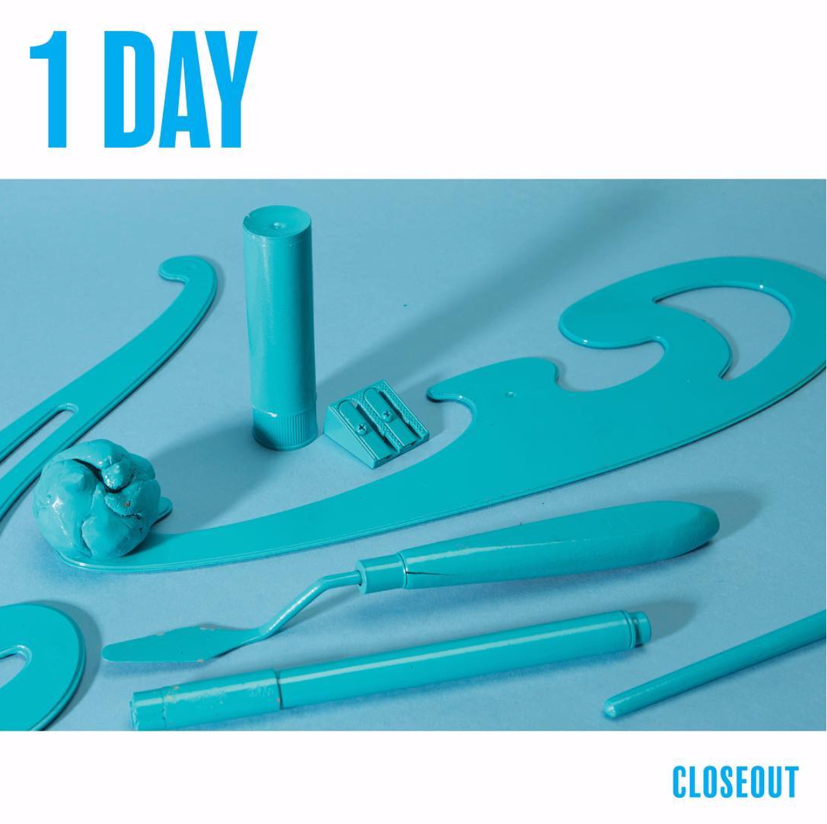
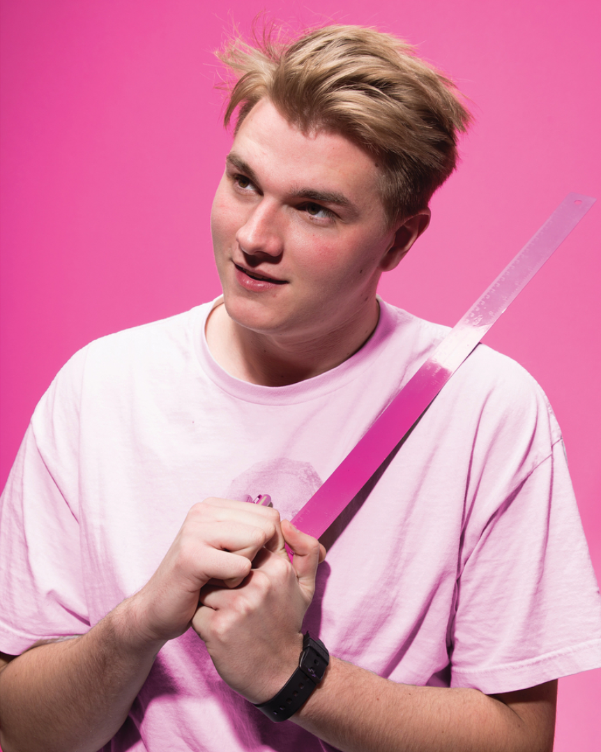
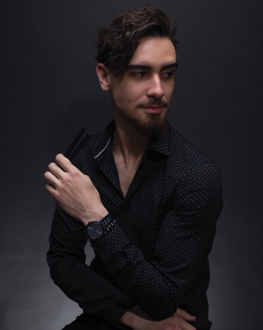
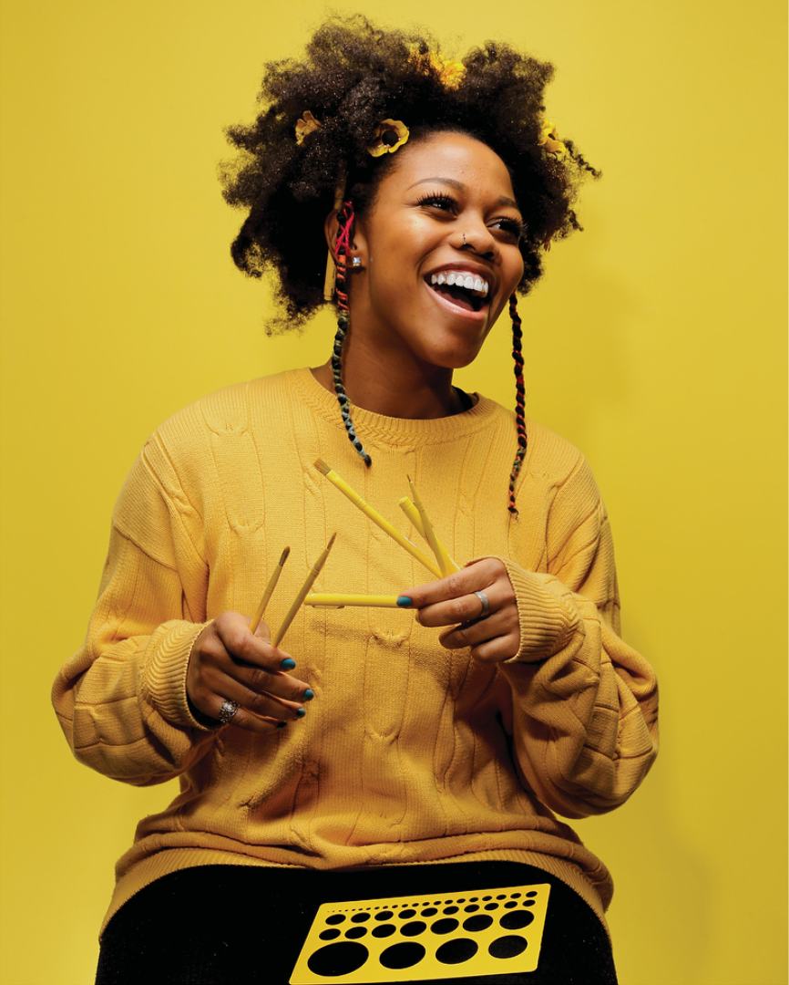
MONOCHROMATIC PHOTOSHOOTS The marketing efforts leading up to our show were one of the most exciting parts of our show. While another group was ultimately responsible for marketing, our art direction team had the idea to really exploit our vibrant colors and create monochromatic content to post on social media to get people excited about the show. Our team organized and executed the photoshoots which included monochromatic portraits of each of the students in the show as well as flat lays featuring spray painted design tools.
• • •
Team Members: Matthew Mitchell, Amanda Venso, Brian Craft, Jacqueline Wammes, Danya Shegdar, Brent Flores