01.
OBJECTIVE I chose to give one of northeast Ohio's most beloved brands a more up-to-date look after familiarizing myself with the brand. Malley's is a small family owned chocolate company based in Cleveland, Ohio. Their brand has become immediately due to the extended use of their two colors, pink and green. Although customers love Malley's as it is, the brand would certainly benefit and expand their market if they refreshed their look in order to attract younger customers.
02.
APPROACH In order to successfully refresh the brand, I had to keep the tradition of Malley's in mind while thinking of ways to improve upon the brand image they have built for themselves. It is important to not lose sight of the current Malley's identity entirely because it is such an icon for those who know the company and those who live in northeast Ohio. Below you will see how I utilized simple design elements in order to give Malley's a fresh identity they could use for the years to come.
03.
DESIGN ELEMENTS In my final solution, I utilized contrasting colors of white and a rich chocolate brown as well as delicate linear elements in order to create an interesting and unifying identity. The lines used in this approach are unique because they are hand drawn and are all of varying widths which is indicative of the piped chocolate you see on top of some of Malley's most famous sweets. The high contrast colors give the brand the prestige feel that it deserves after becoming such a well known brand in the chocolate business, while the hand lettering of the logo and hand drawn lines keep the identity from feeling too ostentatious.
04.
LOGOS The two logos you see above show the two different options as far as color goes for the brand refresh. The top option shows use of a more minimal palette with white being the primary color and the chocolate brown being used as an accent color. The bottom logo shows the opposite. Below, you will see both uses of color utilized and applied to the brand. The logo features hand lettering that reminds customers of Malley's family owned roots.
05.
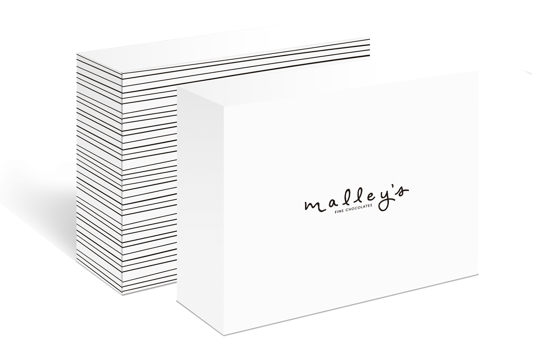
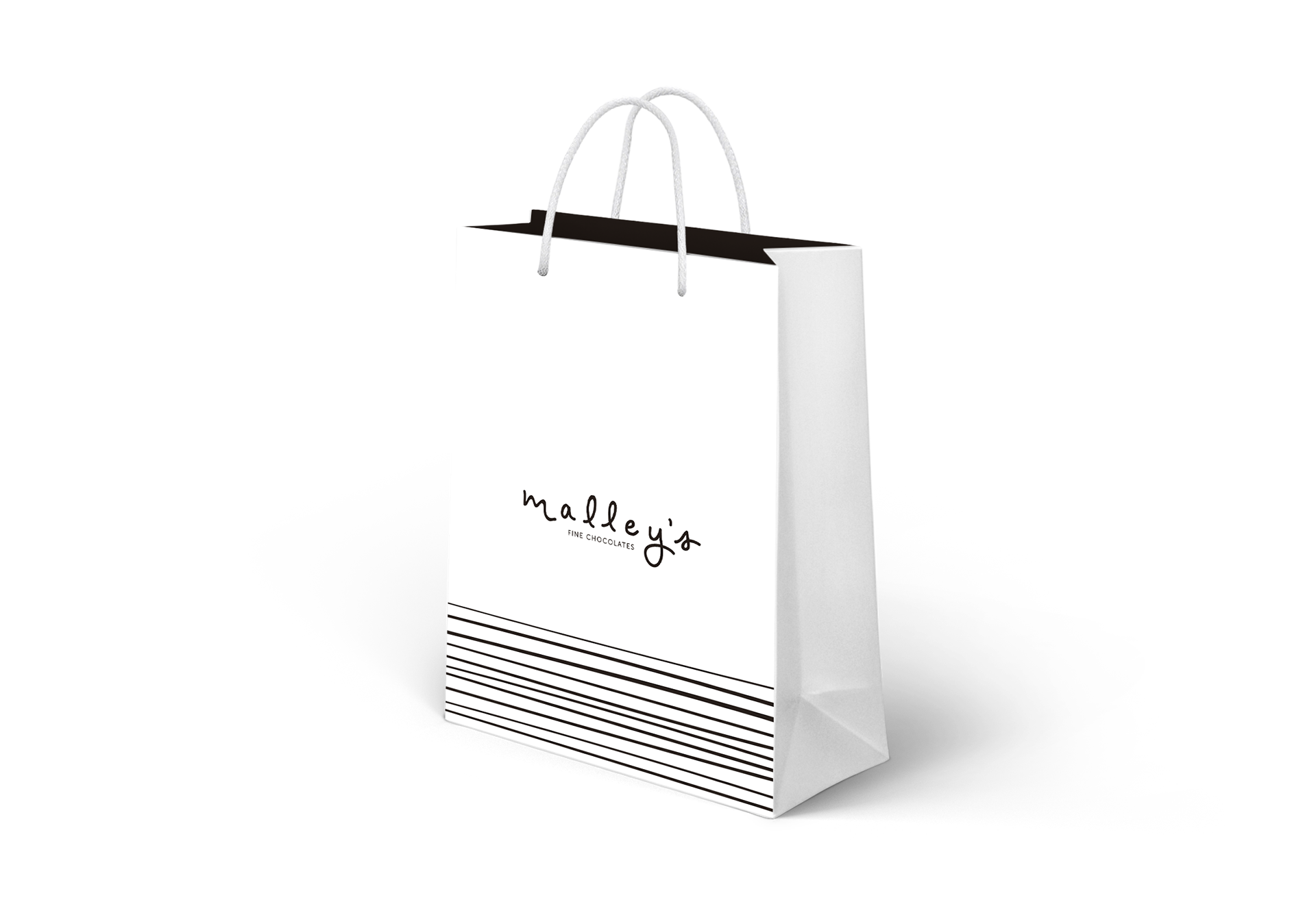
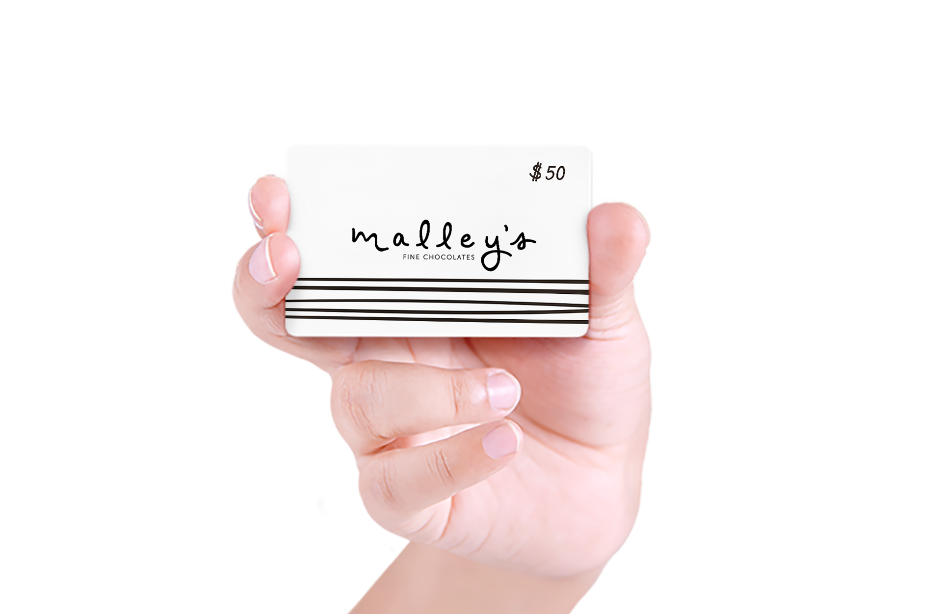
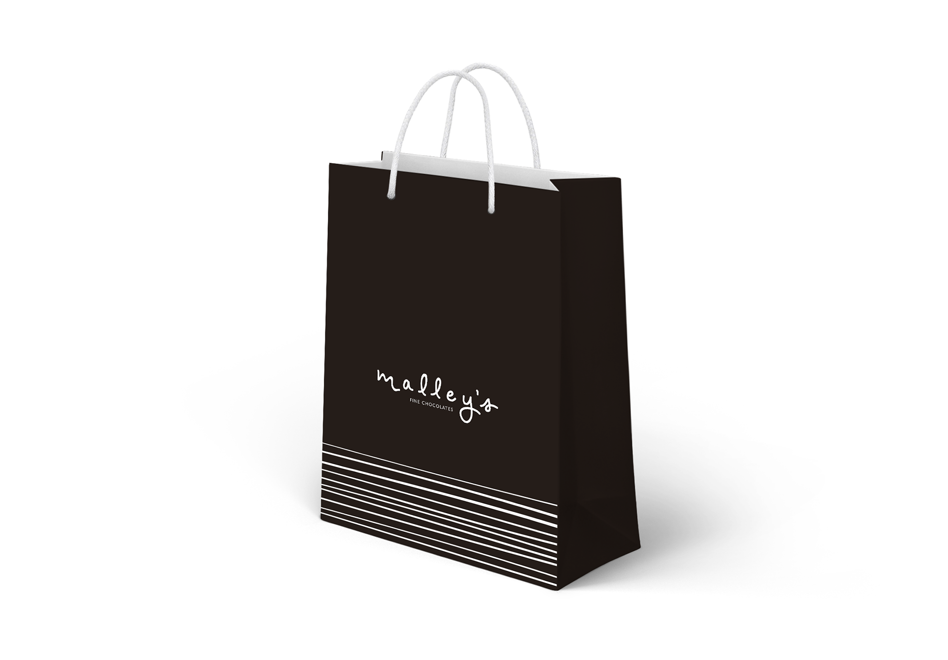
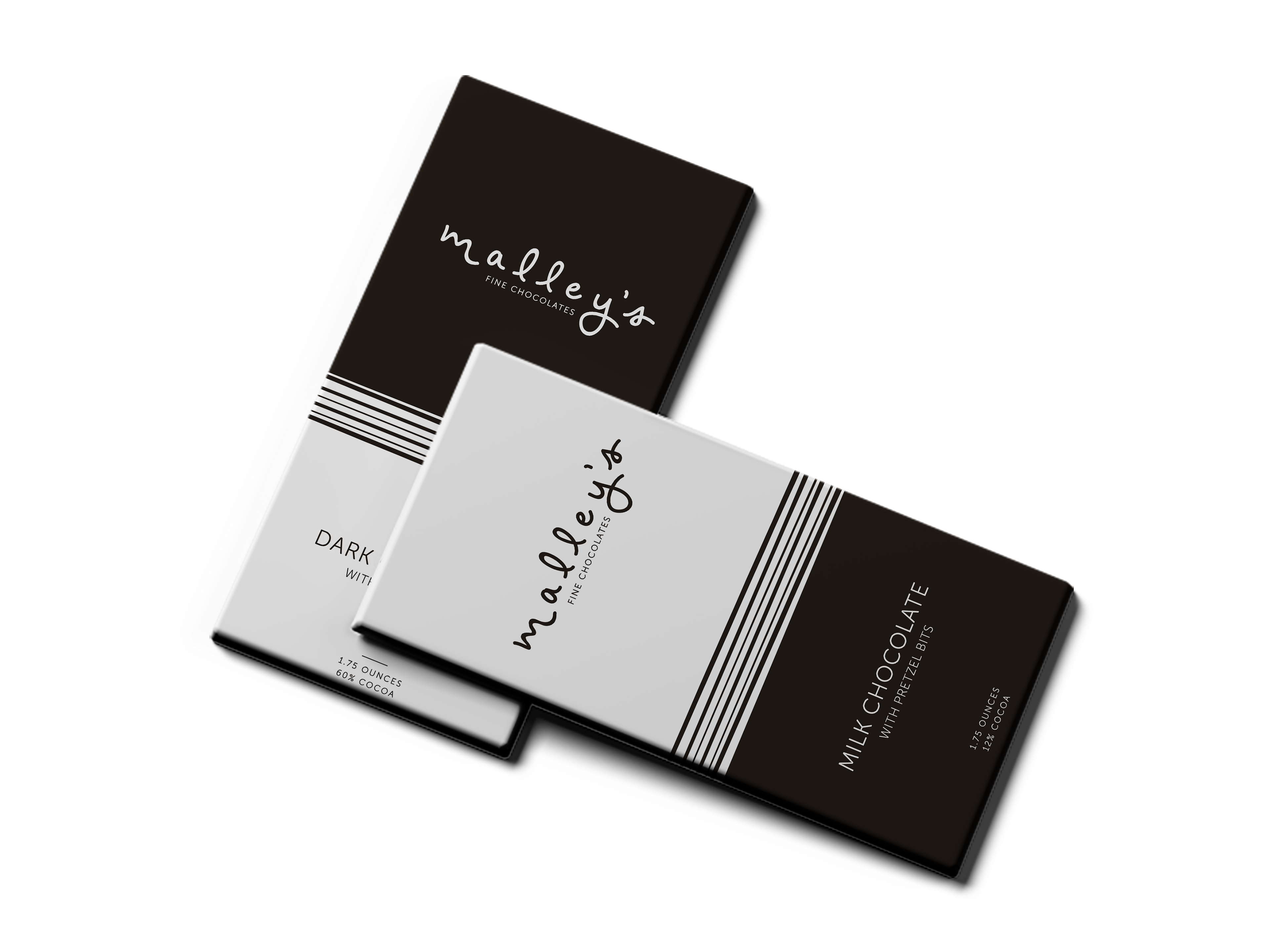
PACKAGING/PROMOTION Pictured above show (from left to right) what a variety box of chocolates, shopping bag, and gift card may look like with the brand refresh. The pieces clearly are all tied together by use of the hand written logo, color, and use of lines, with small variations to keep consumers interested.
06.
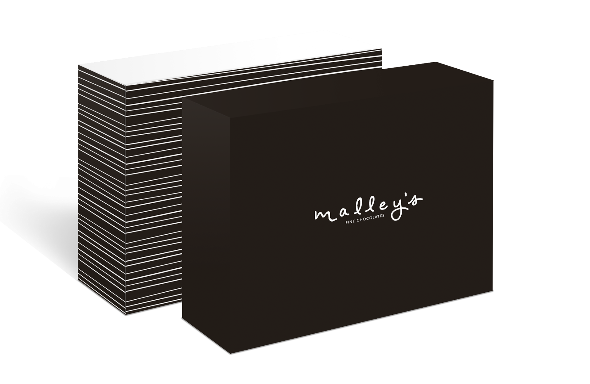
PACKAGING/PROMOTION, CONT. The images above show (from left to right) what a variety box of chocolates, shopping bag, and some of Malley's best selling chocolate bars would look like with use of the dark chocolate color as the primary color.
07.
BILLBOARD The last aspect of this refresh is a billboard promoting the sales of Malley's chocolates. Billboards such as these would surely boost sales for Malley's when placed along the many commuter routes in the northeast Ohio area. The billboard is similar in design to the new chocolate bar wraps and looks as if a bite was taken out of it like the chocolate bars.


