
01.
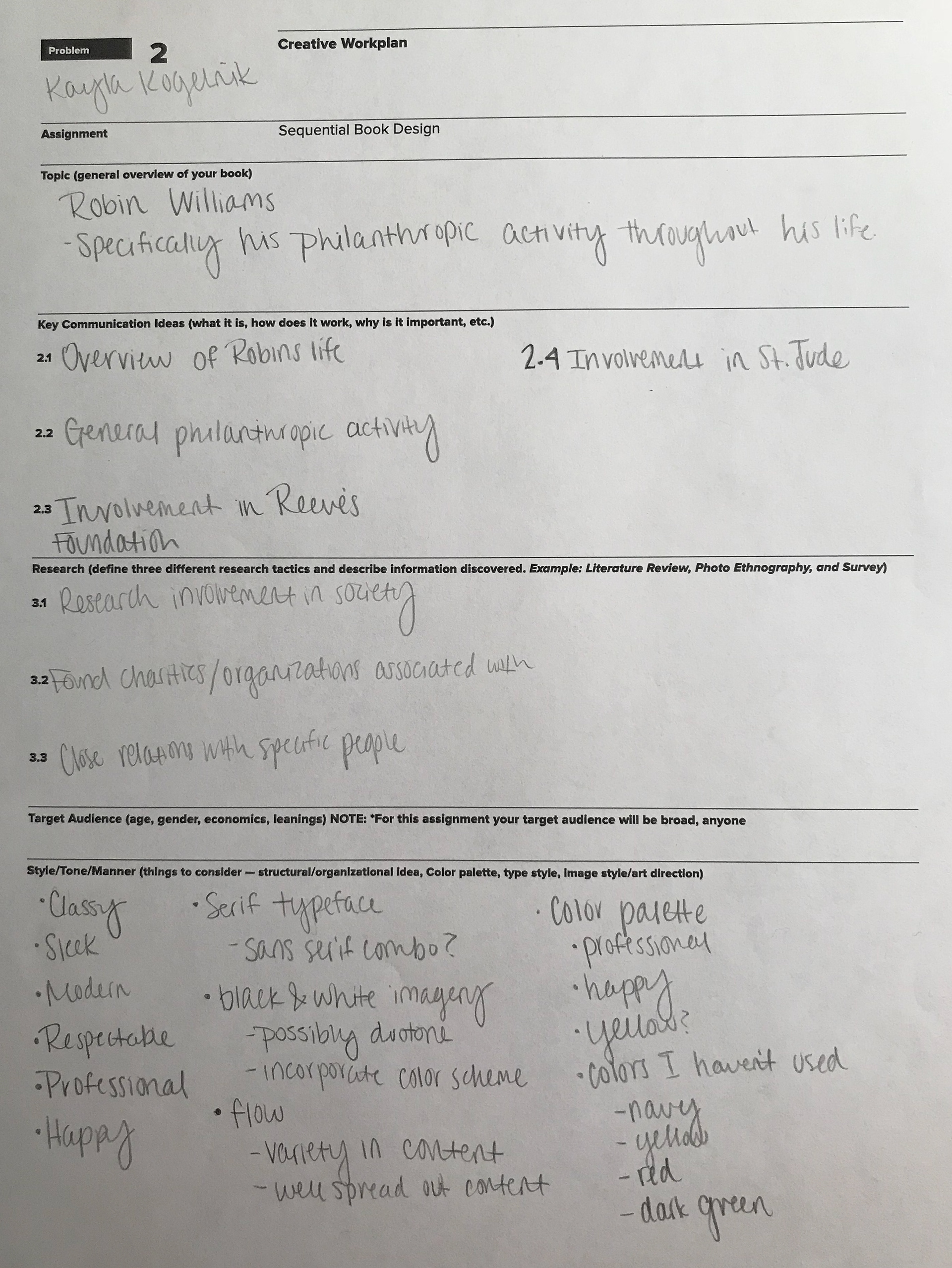
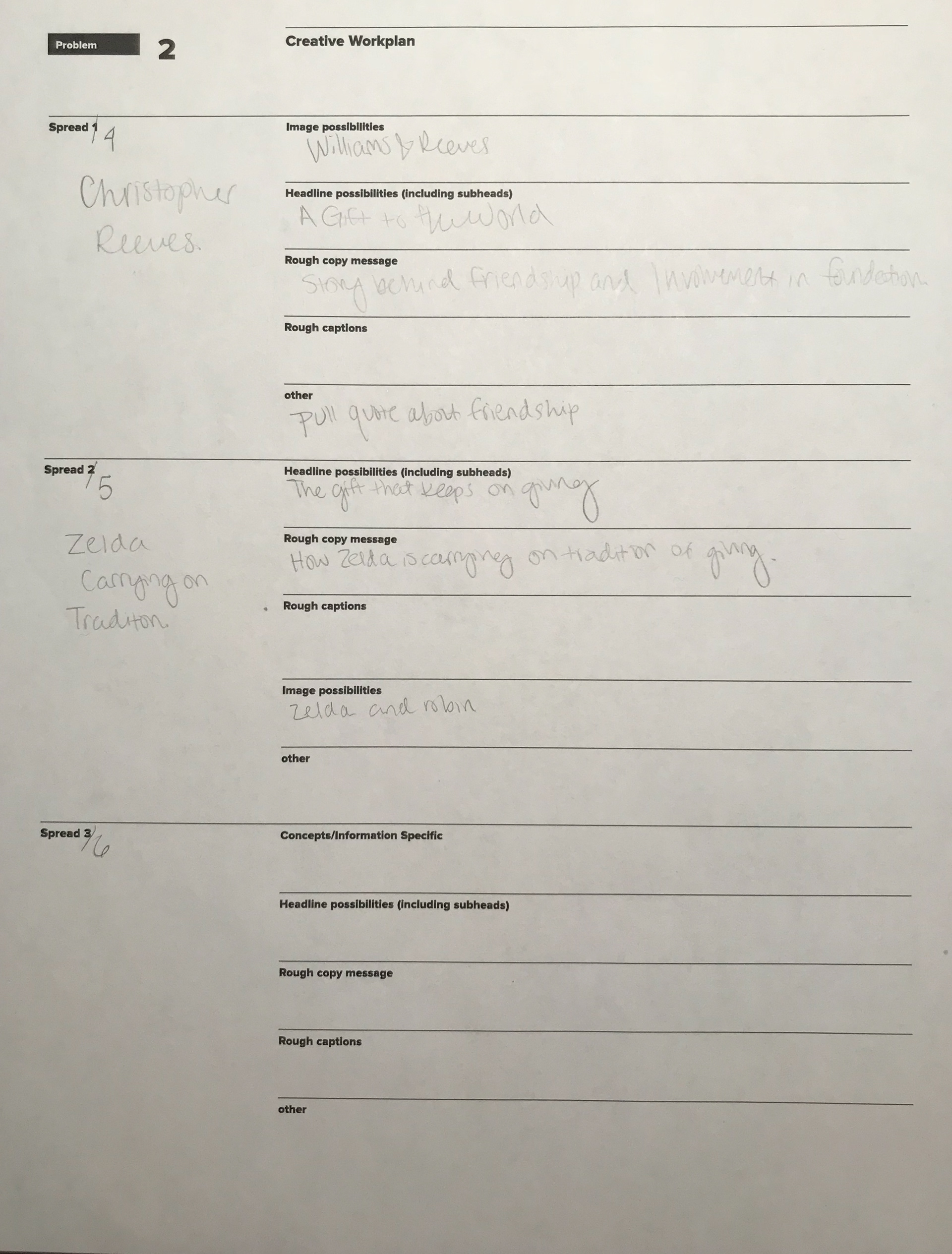
CREATIVE WORKPLAN After selecting Robin Williams as my topic for this book, I immediately began trying to organize my thoughts. In order to do this, I started writing my thoughts down in a creative workplan. This helped me get an idea for the general tone and style that I was looking for, as well as how I would organize the book. You can see this completed document below.

02.
RESEARCH Something that really helped me get my head around this project was actually researching Robin Williams and writing the copy for the book by myself. I spent a few weeks gathering information from multiple resources and getting an idea of how I could best present the content I was finding. When finished with my research, I had three full pages of content to work with along with an array of images from a great photo book created by one of Williams' closest friends.
03.
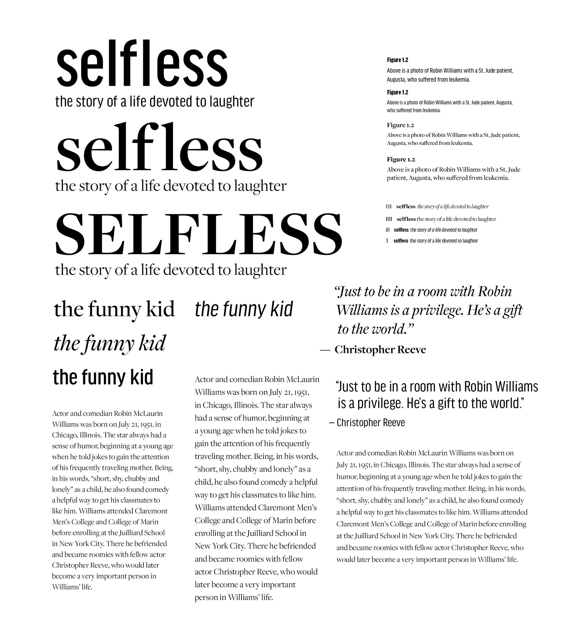
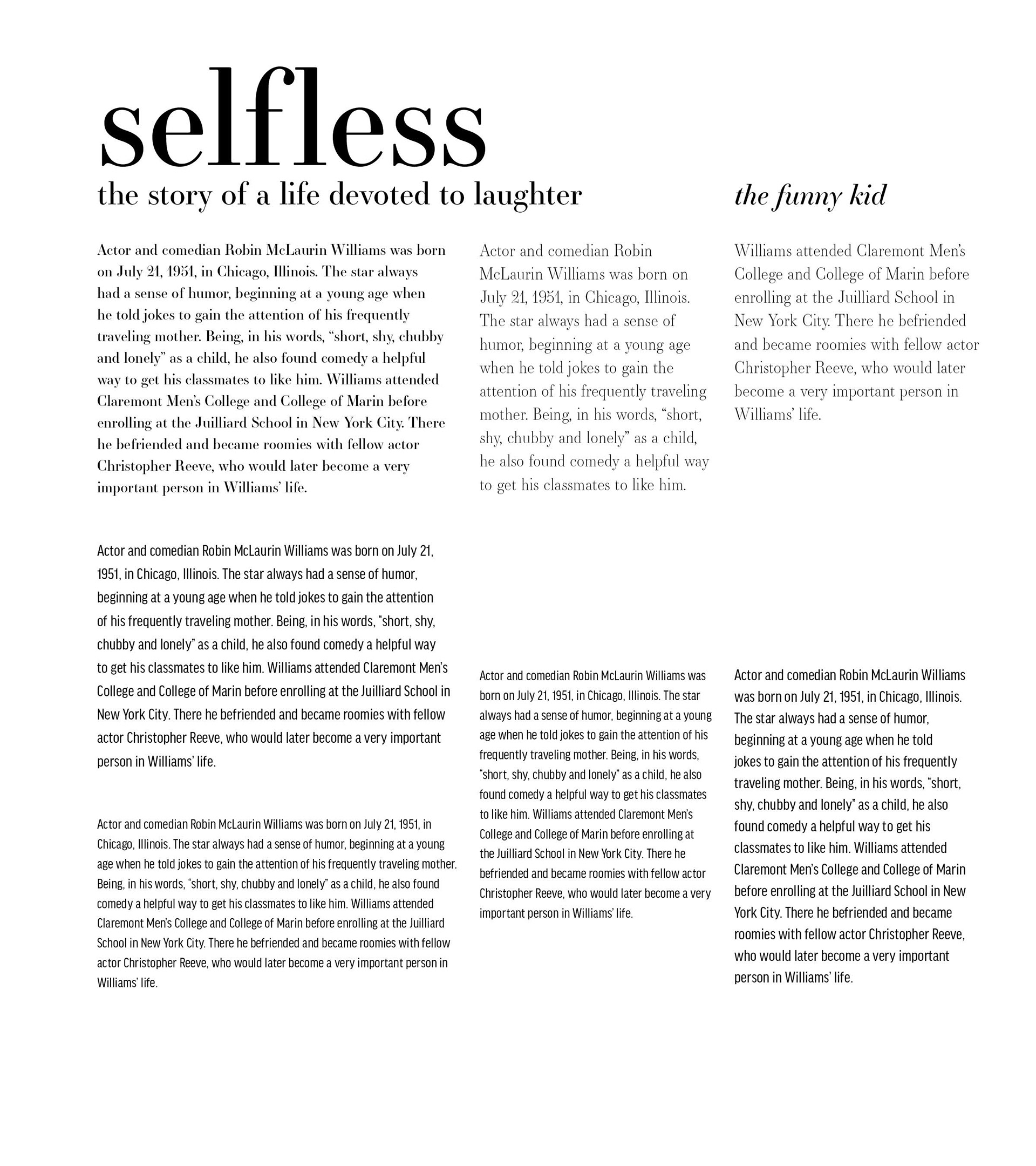
COLOR AND TYPE STUDIES After gaining a better understanding of my subject, I completed color and type studies to experiment with stylistic solutions for this project. This is always one of my favorite steps of a project because of the seemingly endless combinations. I explored a variety of typographic solutions and found benefits of using both serif and sans typefaces. On one hand, I wanted the book to feel sophisticated. On the other hand, I wanted the book to have a clean and modern feel. I was fairly set on my color choices early on in the process. I knew I wanted to incorporate yellow because it is often associated with happiness, an emotion often Robin Williams brought to many. From there, I chose cool colors to pair the yellow with for a modern balance. These type studies and my final color palette can be seen below.

04.
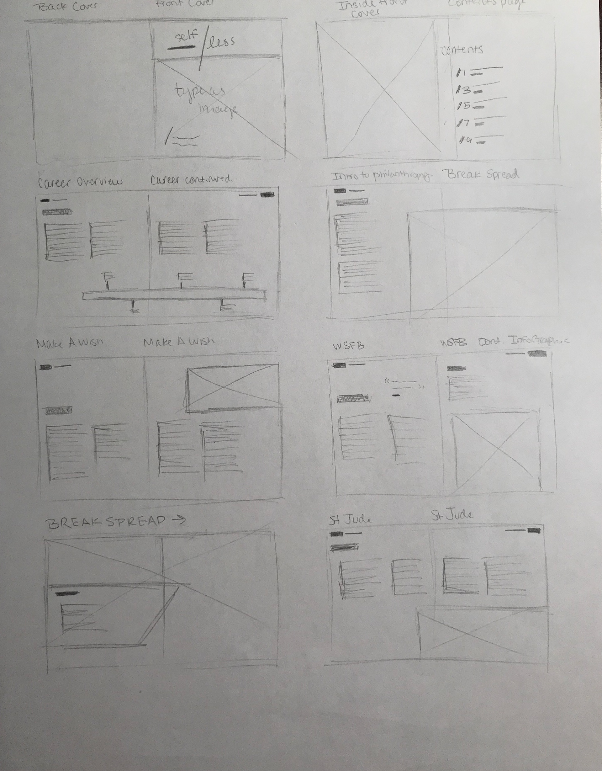
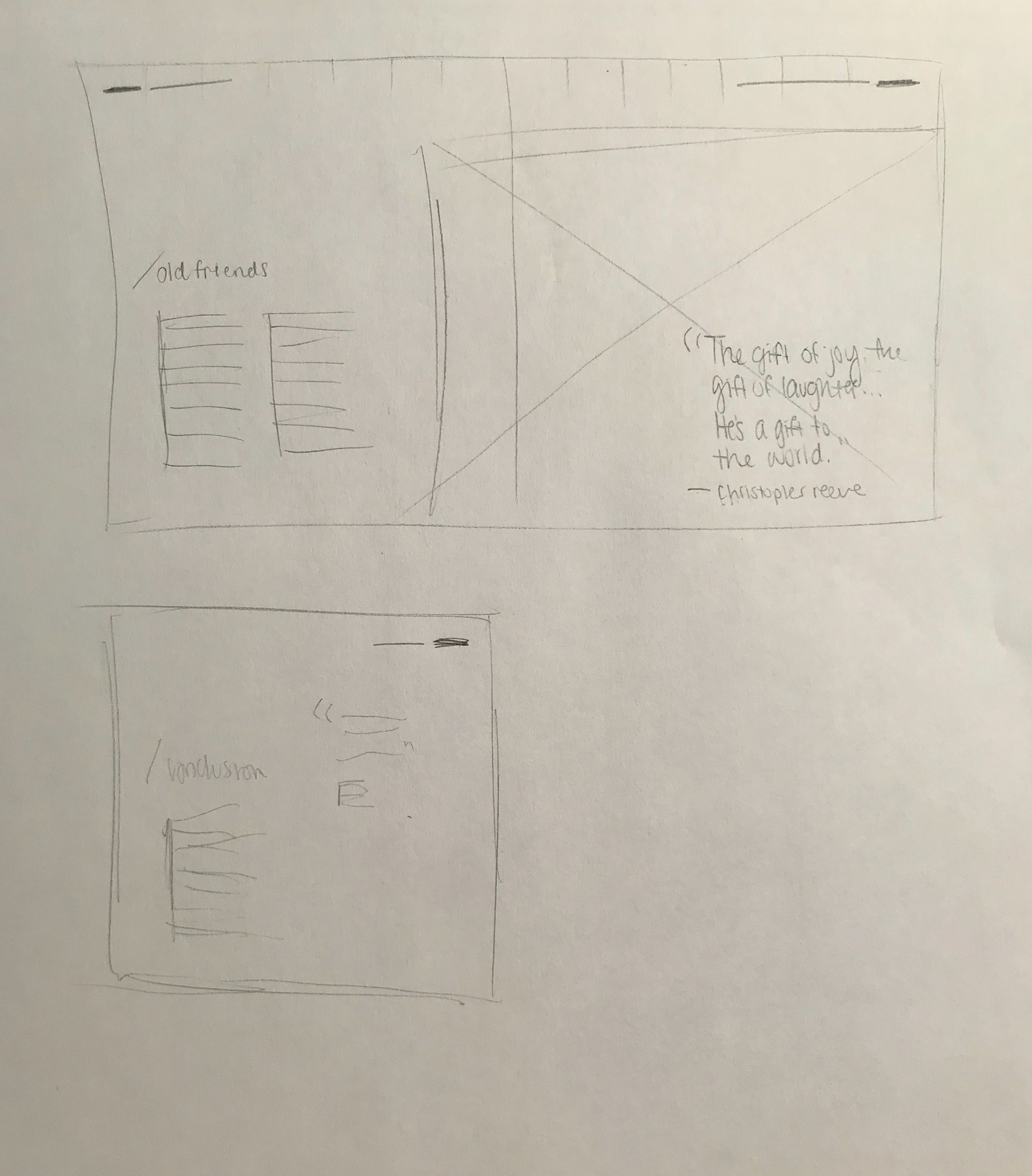
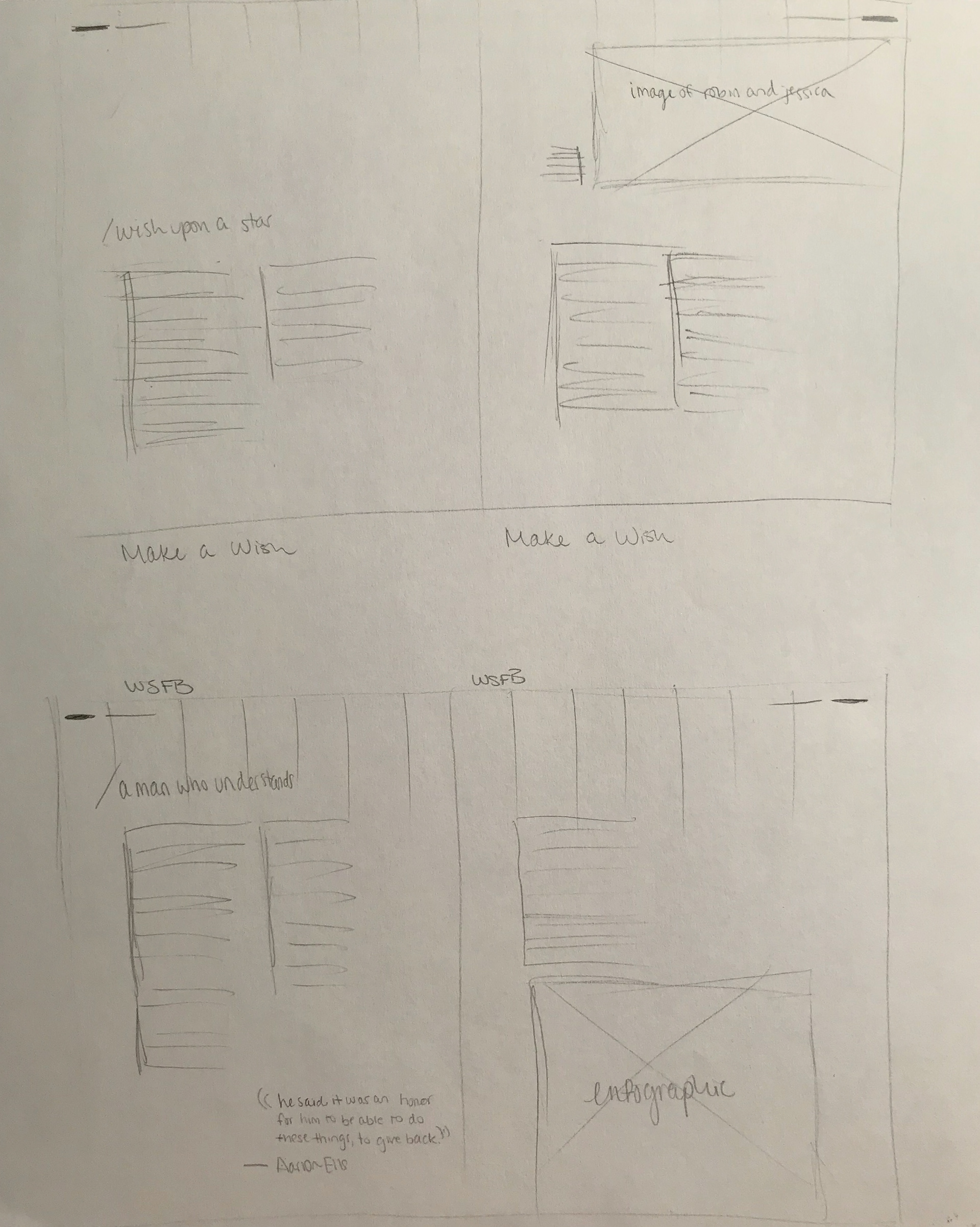
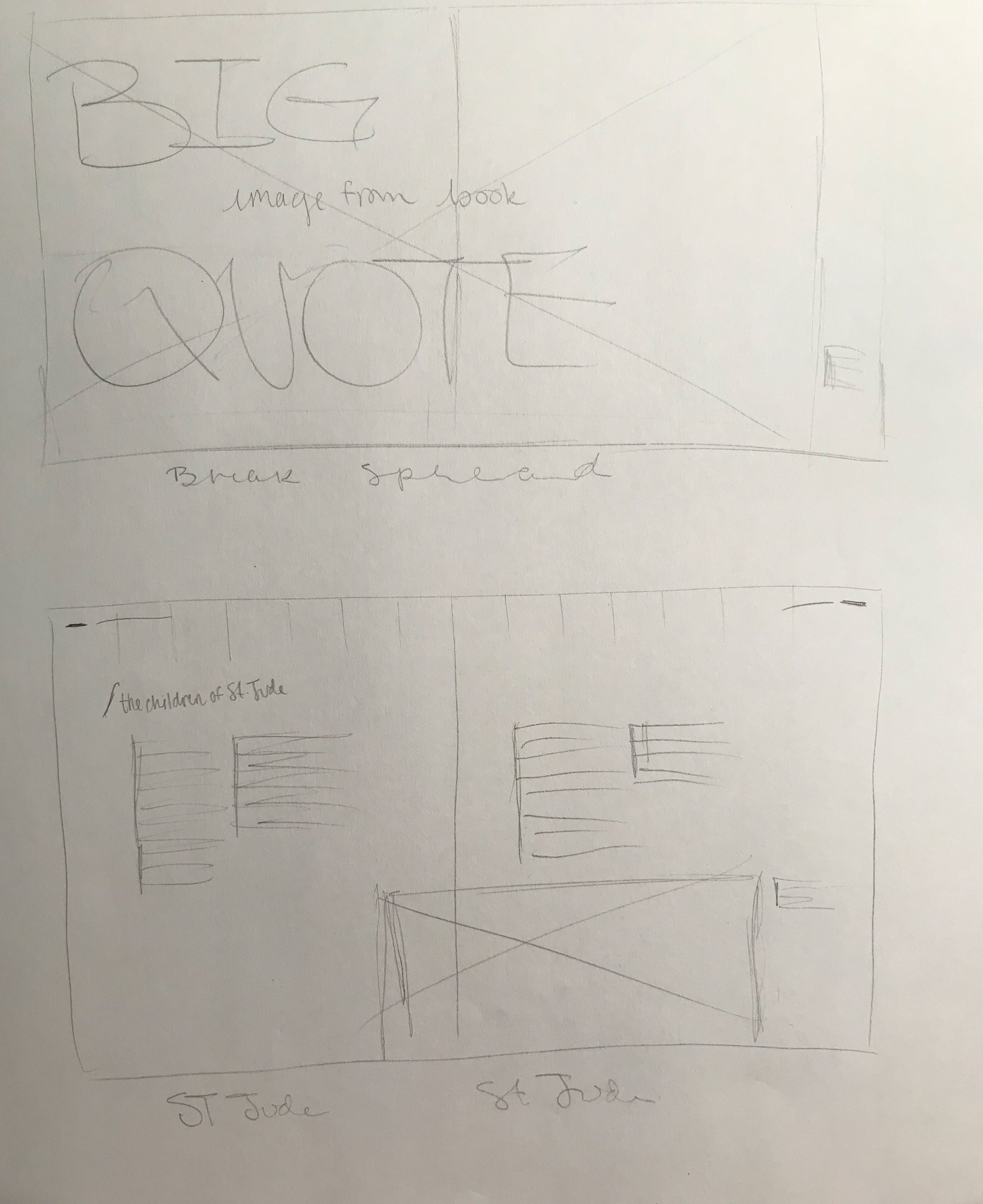
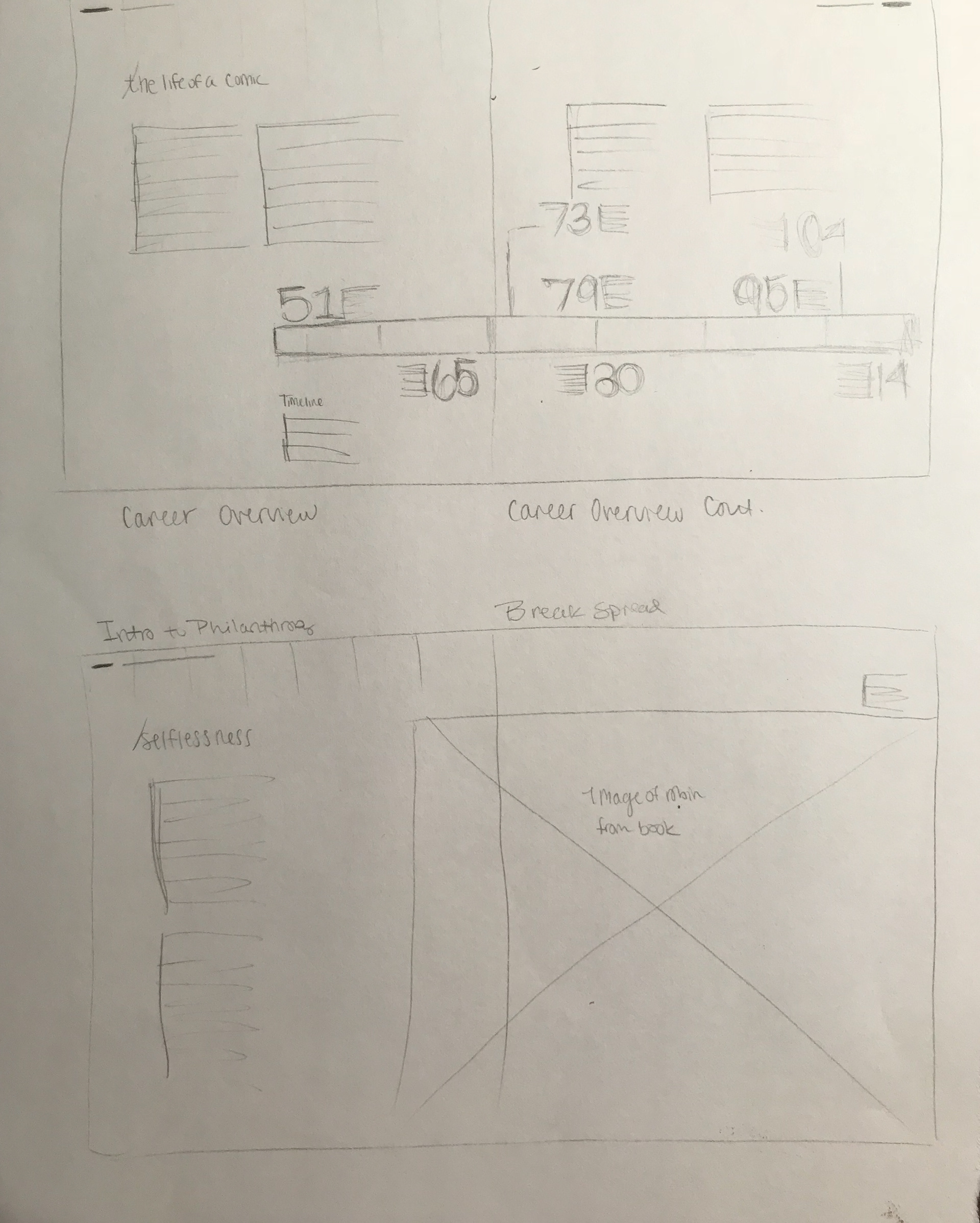
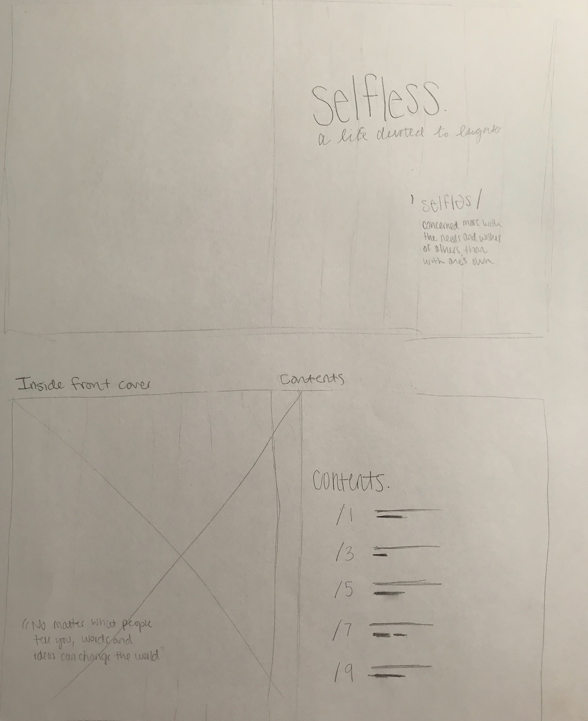
SKETCHING With a clear style and tone in mind, I began sketching ideas for layouts and pacing. Even in thumbnail sketches, I am able to get an idea of where I would like for things to lay on a page. After a few rounds of these sketches, I chose one that made the most sense and used it as an outline or wireframe for my book. I then moved in to larger, more detailed sketches to help me understand just how the details would sit on each page. You can click on the images below to see larger versions of these sketches.
05.
COVER ITERATIONS Most professors would try to talk you out of trying to design book covers for a book that has not yet been designed, but my professor let me try it anyway. While some people would find this to be difficult, I enjoy the guidelines that a book cover can give for the rest of the project. Most of these ideas were pretty rough, but they helped me to get my ideas out. I presented three cover iterations which each had their own style.
06.
LAYOUT EXPLORATIONS Once I chose a visual style I wanted to stick to, I began to work through some layouts. With guidance from my professor, I began setting type and placing images in to my layouts. This first round heavily relied on the sophisticated feel of the serif typeface I chose.
07.
LAYOUT IMPROVEMENTS Once I chose a visual style I wanted to stick to, I began to work through some layouts. With guidance from my professor, I began setting type and placing images in to my layouts. This first round heavily relied on the sophisticated feel of the serif typeface I chose.
08.
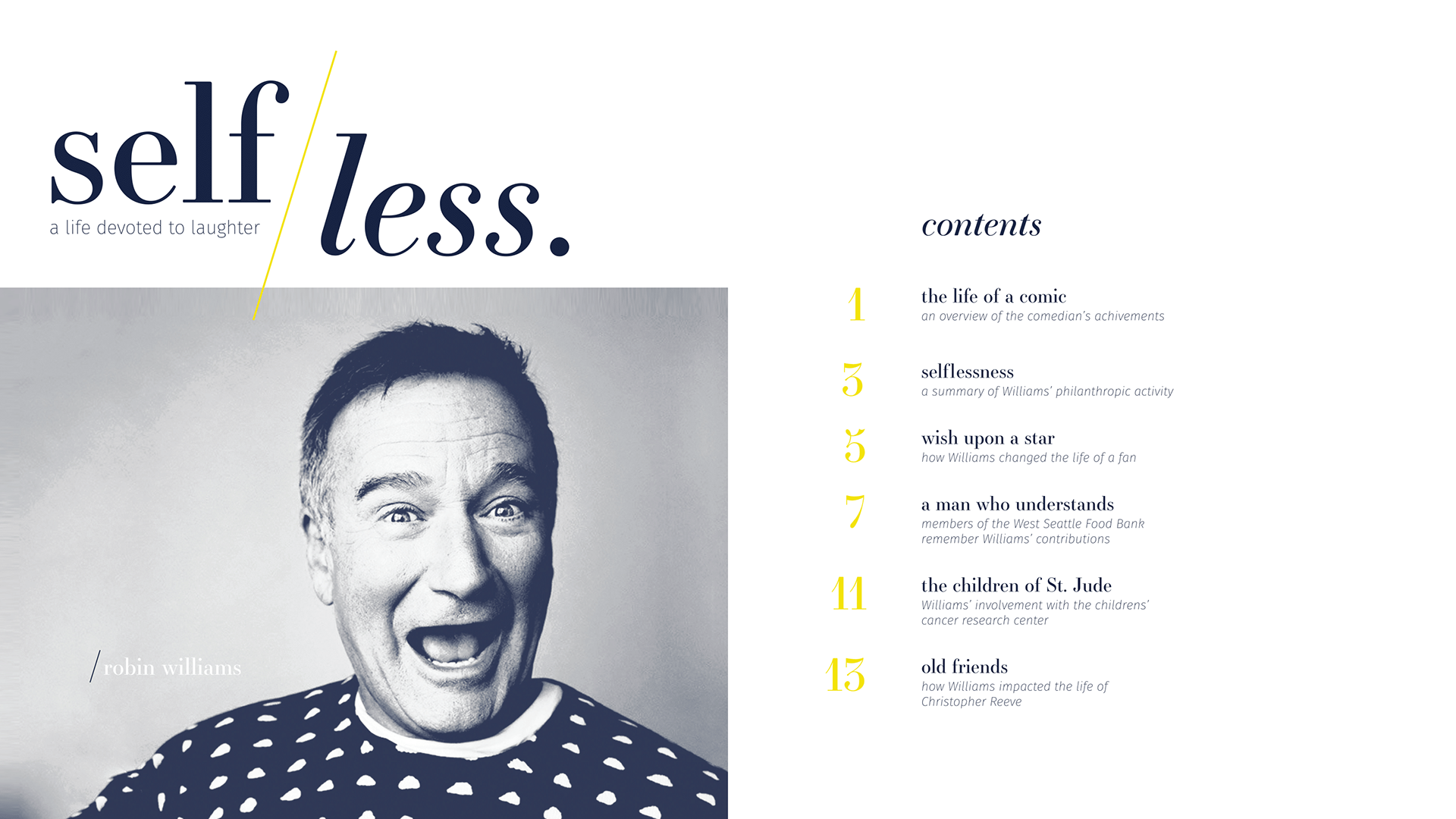
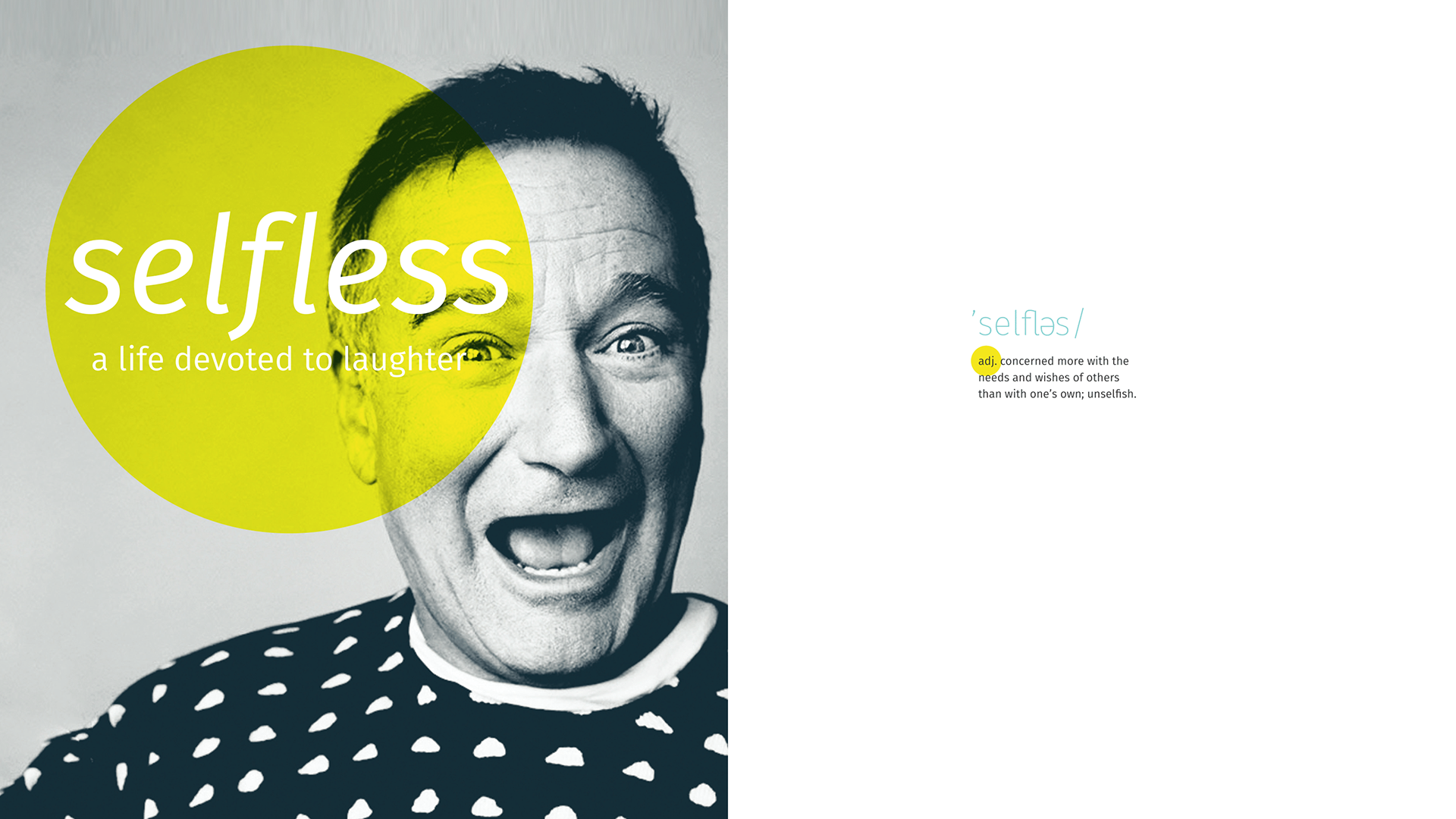
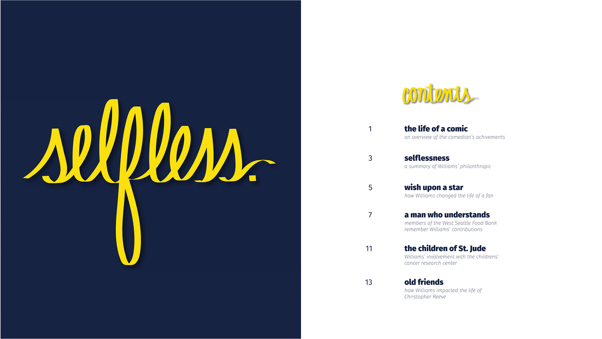
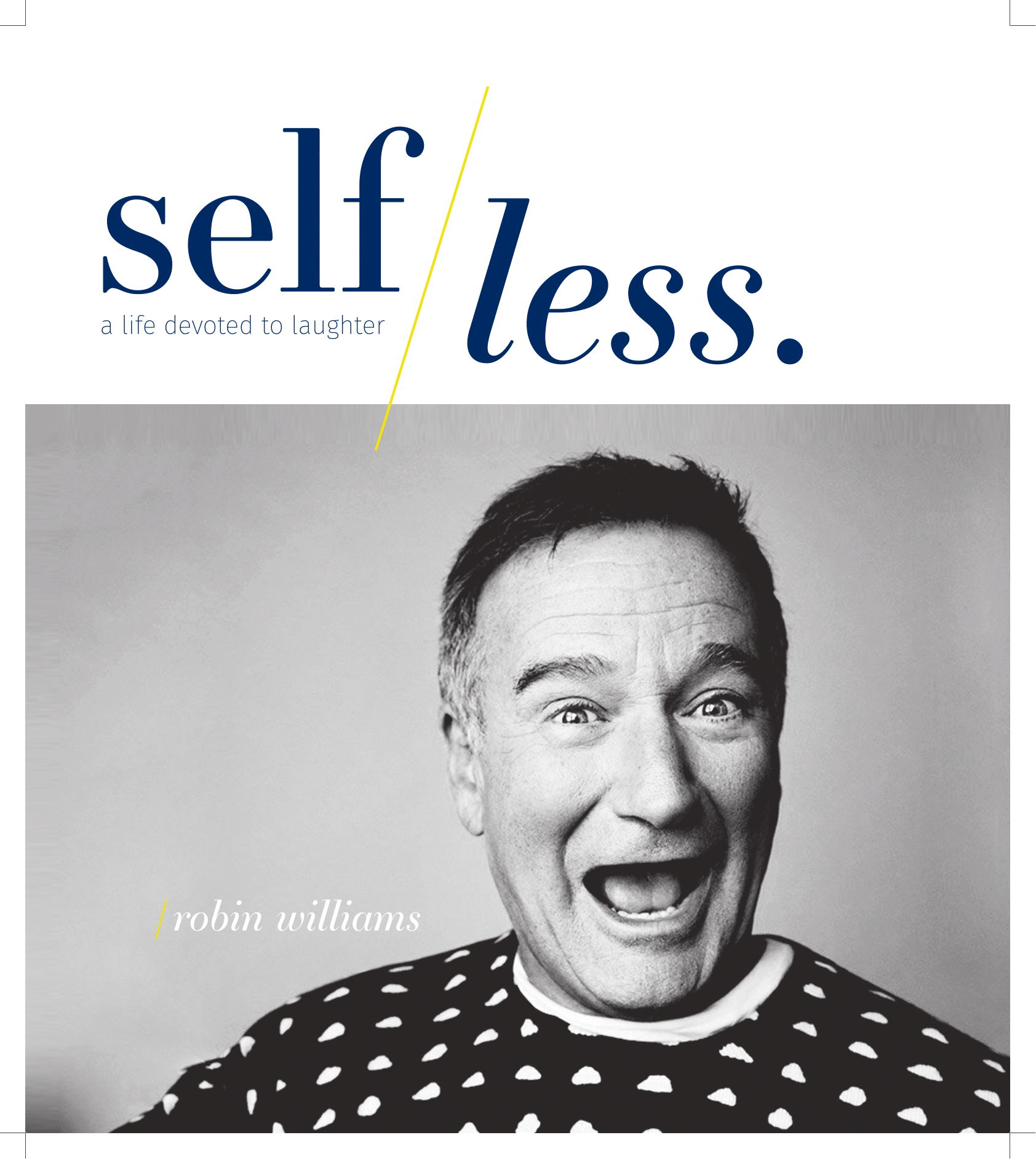
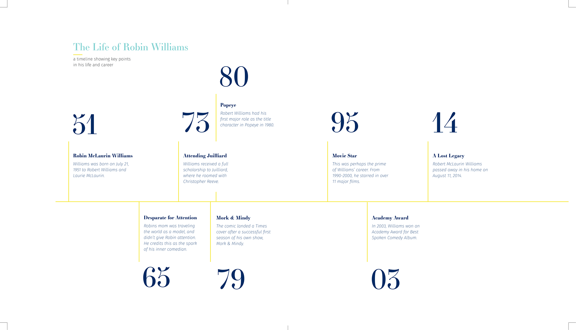
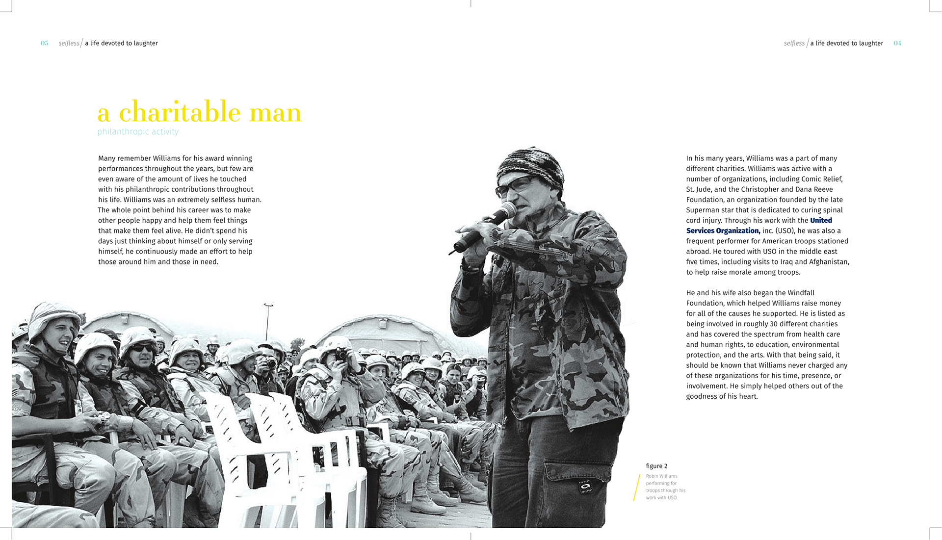
FINAL BOOK With six rounds of critiques behind me and an impending due date, I began to research the best way to print and bind my book. I made some final choices on materials and got to printing. The end result was a perfect-bound 18 page book. Click here to see the finished product.